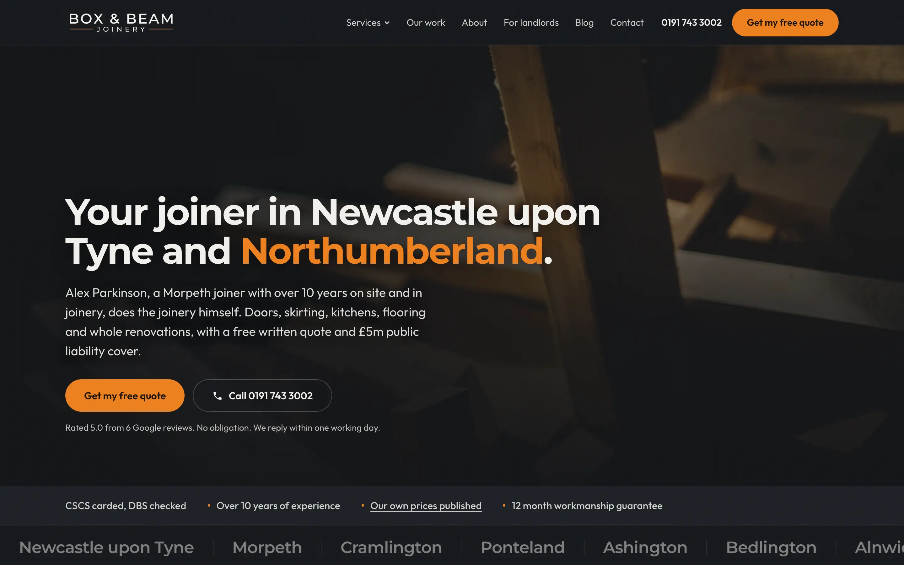
Box and Beam Brand Guidelines
Twenty pages that tell a printer or signwriter exactly how to use the logo
- Client
- Box and Beam
- Service
- Logo files and brand guide
- Where
- North East England
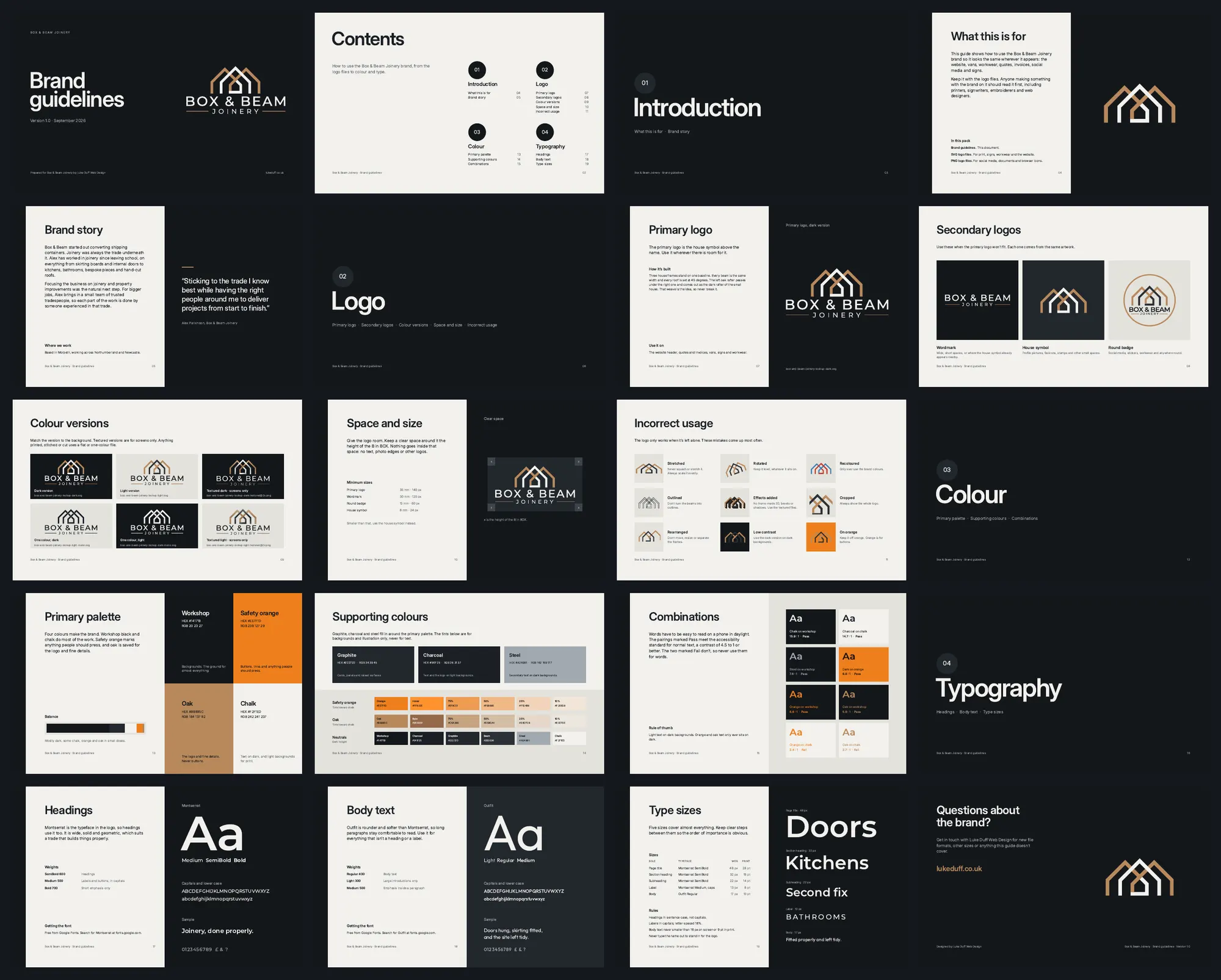
Alex came to me with the Box and Beam logo already designed. My job was turning it into files a printer, a signwriter and a website can all use: clean vectors in light, dark and one-colour versions, and a 20-page guide. It covers the logo and its variations, the space it needs, the four brand colours and which pairs are safe to read, and the two typefaces, so anyone making something with the brand has the rules in one place.
What they asked for
- Turn the existing logo into proper vector files that print, stitch and scale cleanly.
- Supply light, dark and one-colour versions for every background the brand will sit on.
- Write the rules down: clear space, minimum sizes, colours, type and what not to do.
- Hand it over as one pack a printer or signwriter can use without having to ask.
What came out of it
- A 20-page guide covering the logo and its variations, clear space and minimum sizes, incorrect uses, the colour palette and the typefaces.
- A table of which colour pairs are safe to read, with their contrast ratings.
How it was built
- Vector files with no masks or filters, so they come through a printer's or signwriter's software intact.
- The guide is generated from code, so a change to a colour or a typeface updates every page at once.